
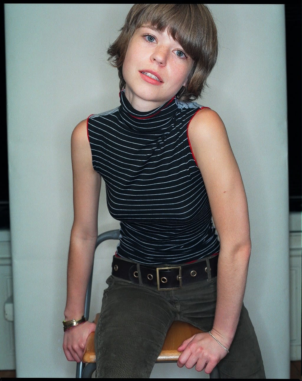
You can date a beauty picture by looking the model in the eye. The reflection there is a diagram of the studio, and in the 1980s the diagram changed.
A catchlight is a lighting diagram drawn on the eye by the light itself, and it is the witness most retouchers forget to coach.
The quickest way to place a studio photograph in time is to enlarge the eyes. Every light pointed at a face leaves its reflection on the cornea, a small bright shape called a catchlight, and that shape is a reliable drawing of the equipment: a window, an umbrella, a square softbox, a bare bulb, a ring. Histories of 1980s fashion photography tend to list names and shoulder pads. Our angle is optical. The decade's look can be described as a small number of lighting decisions, each of which leaves a signature a researcher can find in the picture, and the catchlight is where to start. A catchlight is a lighting diagram drawn on the eye by the light itself, and it is the witness most retouchers forget to coach.
A caution first. No decade has one look, and photographers worked in soft daylight throughout the 1980s. What follows describes the style that later came to stand for the period, and it rests on optics and on dated facts about equipment, film and magazines, not on a claim that everyone did the same thing.
What is hard light, and why does it look glossy?
Hardness is geometry. If the light source is small as seen from the subject (a bare flash head, a spotlight, the sun in a clear sky), every point on the subject is lit from nearly one direction. Shadows have sharp edges. Highlights on anything shiny are small and intense. Skin with a trace of oil or make-up shows bright specular points on the cheekbone, the nose and the lower lip.
If the source is large (a softbox at arm's length, a white wall, a cloudy sky), light arrives from many directions at once. Shadows fade at the edges and highlights spread into broad, quiet sheens.
Gloss, in a photograph, is simply the presence of small hard highlights on a dark or saturated surface. Lipstick, lacquered nails, patent leather, wet hair, vinyl and chrome all look glossier under hard light because the highlight is tight and the colour beside it stays deep. A style that loves shine will sooner or later choose a hard source.
What is a ring flash and where did it come from?
A ring flash is a flash tube bent into a circle around the lens. It was invented in 1952 by Lester A. Dine, for a purpose with no glamour whatever: photographing teeth. A dentist needs light inside a mouth, and the only way to get it there without the camera's own shadow is to send the light down the same line as the view.
That on-axis position gives the ring flash its three visible effects:
- Almost no shadow on the face. Whatever shadows the light casts fall directly behind the features, where the lens cannot see them. Noses lose their side shadow; faces flatten into shapes.
- A ring in the eye. The catchlight is a bright circle, often with the dark pupil sitting inside it.
- Evenness. The light falls off with distance but not across the face, so make-up reads as flat fields of colour.
The macro units made for medical and close-up work are small. For fashion, manufacturers built larger rings, about a foot (0.3 metres) across, with enough power to light a figure. Used close, a big ring is fairly soft; used at a distance, it is a hard frontal source with a tell-tale reflection.
How do you read a catchlight?
This is the practical part. Enlarge the eye and compare what you see with the table.
| Catchlight | Likely source | Character of the light |
|---|---|---|
| Bright ring, pupil inside | Ring flash on the lens | Frontal, shadowless, flat |
| Small round dot | Bare flash head or distant spot | Hard, high gloss |
| Small dot high in the eye plus a fainter low one | Hard key light with a reflector below | Hard, with lifted shadows: a classic beauty set-up |
| Round with spokes or a dark centre | Umbrella or beauty dish | Medium hard |
| Square or rectangle | Softbox | Soft |
| Tall rectangle with bars | Window | Soft daylight |
| Several separate shapes | Several frontal lights | Built, deliberate lighting |
Then check the shadows agree. A ring catchlight with a strong nose shadow means a second light was doing the work and the ring was only fill. A square catchlight with knife-edged shadows means the softbox was a long way off. Catchlights can be removed or added in retouching, but shadow edges are much harder to fake, so the two together are good evidence. Our free image compare tool is useful for putting two enlargements side by side.
Which photographers and magazines set the taste?
The lighting did not arrive by itself. A handful of dated facts mark the shift.
1980. Helmut Newton began the Big Nudes, full-length figures against a stark studio backdrop, published as a book in 1981. Richard Avedon, who had turned from daylight to studio strobe in the late 1950s and stripped out soft lights and props, began recurring campaigns for Gianni Versace; he photographed most of American Vogue's covers from 1973 to late 1988, so his clean frontal studio light was on newsstands every month. On 1 May, Nick Logan launched The Face in London with £3,500 of his savings.
1981. Newton's Naked and Dressed series started in Italian and French Vogue. Avedon photographed Nastassja Kinski with a serpent.
1982. Neville Brody became art director of The Face. The magazine's style pages were shaped by Buffalo, the collective led by the stylist Ray Petri with the photographer Jamie Morgan among its members. A magazine started on one man's savings, with a strong graphic identity, is the kind of place where a plain background and a single direct light make sense.
1983. Vanity Fair hired Annie Leibovitz as its first chief photographer, a sign of how much weight magazines now put on the produced, lit, conceptual portrait.
Mid-decade. Terence Donovan, a fashion photographer since the 1960s, directed the video for Robert Palmer's "Addicted to Love", with its identically styled models, red lips and slicked-back hair. The Guardian has called it "fashion's favourite video". It is the decade's taste for gloss, in motion.
1987. Guy Bourdin, whose saturated, lacquered colour in the 1970s had anticipated much of this, shot a Chanel campaign that won the International Center of Photography's Infinity Award the following year. His earlier work is the subject of our piece on the Charles Jourdan shoe adverts.
These photographers were not following a common formula. What they shared was a preference for the constructed over the caught, which is the opposite of the preference described in our account of what made a 1960s fashion photograph look like the 1960s.
What part did transparency film play?
A large one. Professional colour work for magazines and advertising was shot on colour reversal film, which yields a positive transparency the printer can match by eye. Transparency film is contrasty and has little tolerance for exposure error: get it right and colours are dense and clean; get it slightly wrong and highlights burn out or shadows block. Studio flash, which is consistent from one exposure to the next and balanced for daylight film, made getting it right a matter of routine, with a Polaroid test to confirm.
Hard light and transparency film reinforce each other. The film's contrast deepens the saturated areas, the flash keeps the highlights small, and the result is the hard-edged, high-colour picture the decade is known for. The film industry noticed what its customers liked. In 1990 Fujifilm introduced Velvia, an E-6 transparency film described as having "an extremely high level of color saturation" and compared with Kodachrome 25, until then the standard by which slide films were judged. Velvia belongs to the 1990s, but it is best understood as the 1980s taste turned into a product.
For the mechanics of the format, see our articles on why studios used medium-format transparency film and what a transparency is.
How can you test a picture for the 1980s look?
A short scoring list for researchers and for anyone evaluating how well an image model understands period style:
- Catchlights: ring, dot or multiple hard sources, not a window.
- Shadow edges: sharp, or absent because the light is on axis.
- Specular highlights: small and bright on lips, skin, hair and accessories.
- Background: plain white, black or a saturated colour, evenly lit.
- Colour: dense primaries; check with a colour palette generator for a few dominant, saturated hues.
- Tonal range: a full histogram with strong blacks; the image histogram tool shows it.
- Original medium: a colour transparency, where the original can be examined.
Items one to six can all be imitated today, which is why item seven and a dated source matter most. As with any style signature, the look tells you what a picture resembles, not when it was made.
What does the Robert Harper archive hold?
A studio's worth of exactly the subjects this lighting was built for. Beauty and cosmetics is one of the catalogue's 24 principal categories, and the inventory lists 35 cosmetics folders with 4,531 unique shots across 14,627 frames. Among them are 223 shots of lipsticks, including some catalogued as underwater and in ice, and 301 of nail varnish. There are 11 hair folders, and a folder of cameras and film as subjects (86 shots). The principal format is 6 x 7 colour transparency film. Robert Harper contributed to Elle and The Telegraph Magazine for more than fifteen years, and his work also appeared in The Face, among other titles.
The inventory does not record lighting, and we have not examined the frames for it, so we make no claim about how any picture was lit. That is a question for someone with a loupe, and more than half of the archive is still on film and has yet to be scanned. The beauty and cosmetics collection, the fashion collection and the cameras and film collection are the places to begin, and the photographers index has entries for the photographers named above.
Researchers, picture editors and data teams interested in studio beauty and product material can ask for professional access.
Frequently asked questions
What lighting was used in 1980s fashion photography?
Electronic studio flash, often used hard: a small or undiffused source aimed directly at the subject, sometimes a ring flash around the lens, with white or strongly coloured backgrounds. The result is crisp shadow edges, shiny skin and lips, and bright, saturated colour on transparency film. Softer daylight styles continued alongside it, but the hard, glossy studio picture is the one the decade is remembered for.
What is a ring flash and what does it do?
A ring flash is a circular flash tube that surrounds the camera lens, so light travels to the subject along the same axis as the view. It casts almost no visible shadow on the face, flattens modelling, and produces a ring-shaped highlight in the eyes. It was invented in 1952 by Lester A. Dine for dental photography and later adopted for fashion.
What is the difference between hard light and soft light?
Hardness depends on the size of the light source as seen from the subject. A small, distant or bare source gives sharp-edged shadows and small bright highlights: hard light. A large, close or diffused source, such as a softbox or an overcast sky, gives gradual shadow edges and broad highlights: soft light. The 1980s studio look favoured the former.
How can you tell what lighting was used in a photograph?
Look at the catchlights, the reflections of the lights in the subject's eyes, and at the shadow edges. A ring means ring flash; a square or rectangle means a softbox or window; a small dot means a bare or distant source. Sharp shadow edges indicate hard light, gradual ones soft light. The number of catchlights suggests the number of frontal lights.
Why do 1980s photographs look so colourful?
Several things combined. Studio flash gives clean, daylight-balanced light that renders colour strongly. Professional work was shot on colour transparency film, which is contrasty and saturated when correctly exposed. Styling, make-up and coloured backgrounds were bold. And magazine printing had improved. Fujifilm's Velvia, introduced in 1990, later made high saturation a selling point.
Sources
- Ring flash (Wikipedia)
- The Face (magazine) (Wikipedia)
- Velvia (Wikipedia)
- Helmut Newton (Wikipedia)
- Richard Avedon (Wikipedia)
- Terence Donovan (photographer) (Wikipedia)
- Guy Bourdin (Wikipedia)
- Fashion photography (Wikipedia)
Published by Archive.London. Corrections are welcome under our editorial policy.